Time shifts
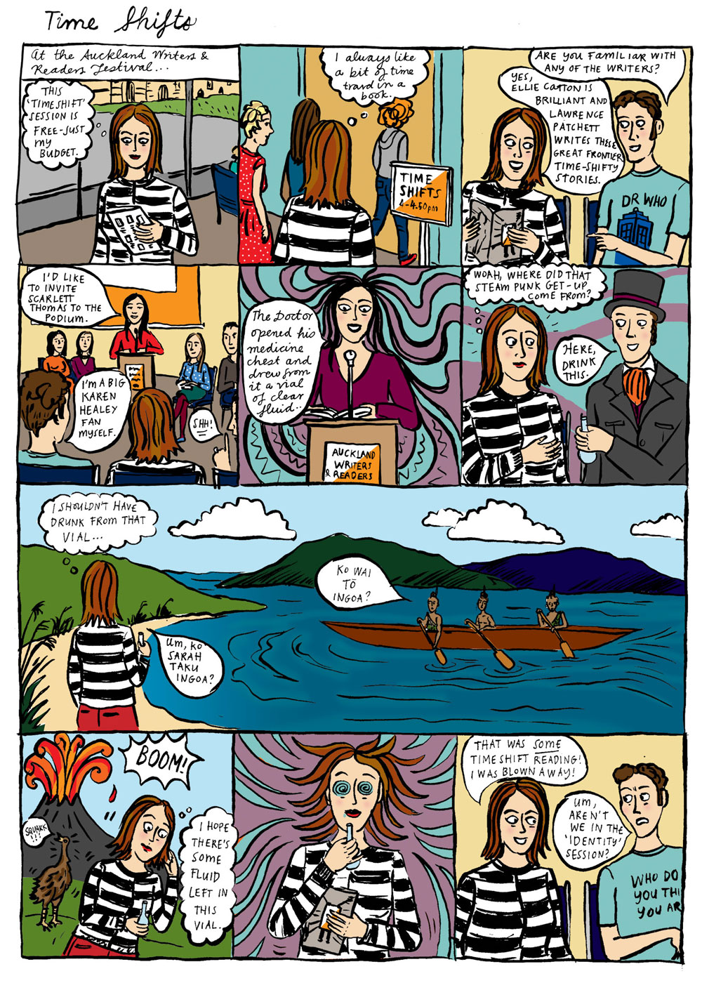 This is my comic from May’s Metro magazine. It was about the Writers’ Festival – my brief is to be quite current about local events. I wrote it just before I read Scarlett Thomas’s book ‘The End of Mr Y’, which was quite intoxicating and brainy, full of quantum physics and travel into weird realms. I am always impressed by people who can write fantastical fiction. I usually find myself writing in a realist vein (although there were a few magi-realist stories slipped into my first collection.) I can draw surreal, fantastical stuff – my hand slips out of reality more easily than the language part of my brain does.
What also strikes me about this comic is that my colour palette is far brighter than this month’s comic’s. I’ve been reading a lot of Luke Pearson in the last month and I decided I wanted to colour like him. Any thoughts? Bright or muted? Or maybe you prefer black and white.