Searching for the book cover again


Last year I posted about designing the cover for my forthcoming book, ‘The Fall of Light’. I’m at it again because those were only interim covers, and now I have to do the real thing. In some ways I find designing book covers an agonising process. I’m never happy with what I’ve done. Sometimes – rarely – I feel sure about a cover. I have the idea in my head and it comes out on the paper. But mostly I feel a niggling sense of doubt, like what I do is never going to be good enough. To assuage that doubt I keep drawing, hoping that the next one will be the good one, that the last one was just a door I had to go through.
I had a fairy story I loved as a child, in my Ruth Manning Sanders book. It was called ‘Long, Broad and Sharpsight’. A young prince is given a key to a tower by the king and told that he can chose whichever bride he sees. He goes up the cobwebby stairs and there are 11 stained-glass windows, and in each window is a princess. He is astonished by their beauty and cannot choose between them. They hold out their hands, laughing, imploring him to choose them. Then he sees a white curtain and he lifts it up. Behind it is a princess who is beautiful but terribly sad. He decides that he must have her. He runs downstairs to tell the king. The king says ‘Oh, why did you have to choose her? She is in the power of a wicked wizard’. But he is sure that she is the one and goes on an epic quest to free her, helped by a man that can stretch to an incredible height, another that can see around the world and another that can swallow a whole ocean.
I’m not sure exactly what this has to do with my covers, because none of them are particularly beautiful. But maybe it has something to do with the artistic pursuit. You can’t just settle on something pretty – it has to move you. It doesn’t come easily – you have to swallow whole oceans to find it. It’s not obvious – it requires some struggle or quest to find it. Then again maybe the king is right – you should just pick the easy options. You shouldn’t torture yourself. And here’s another question – what happened to the princess after she was rescued from the wicked wizard? Did she maintain her beautiful melancholy? Or did it vanish and she became ordinary in her prettiness like the rest of the princesses? If she stayed sad did she drive the prince crazy with all her weeping? Did he have to send the herbalist out to gather extra supplies of St John’s Wart while he went off hunting to get away from her?
One of the things designing this cover has in common with the theme of my book is possibilities. My hero, Rudy, is an architect who is troubled by all the buildings he lost, all the designs he loved that were rejected by clients. He didn’t have a blog. Instead he cast all his favourite lost designs in glass. But maybe it’s good to lose things. I discarded thousands of words from my novel and I hope it’s better for it. We will decide on a cover – not just me, but a whole group of people. And once that cover is chosen, that’s what the book will be. All those other possibilities will be forgotten.
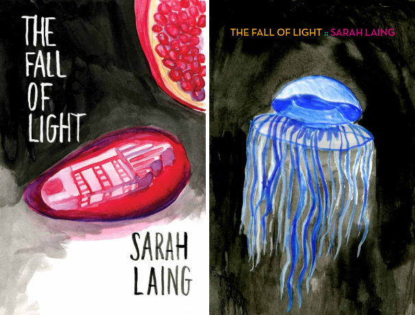
(oh, and if you’re wondering about the provenance of the images, most of them are mine but some of them I cribbed off the internet.)


I really like the very top left one, because it makes me curious about what’s inside, as if anything could be inside. I like the finger pointing photo one too, (you need numbers on these) because it looks fun. The last two look serious. Good luck! They are all lovely designs, you clever thing.
Hi Sarah. I love the concept with the pencil. instant emotional connection right there with the hand drawn title, and the pencil, just used, laying on the page. it’s both beautiful and suggestive of the illustrative delights inside, without looking ‘graphic novel’. Moves it beyond expected novel cover layout. Looking forward to reading!
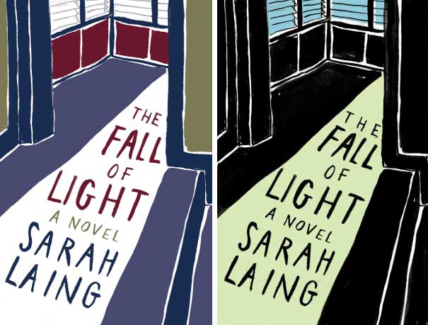
I like the man lying at the bottom of the cover with the beam of light full of houses. I think it speaks of ideas and dreams/visions of creativity, and a golden light bringing warmth/happiness/purpose to ones life. I checked with my husband and he chose the same one too – so either I have good taste, or we are both nuts HA!
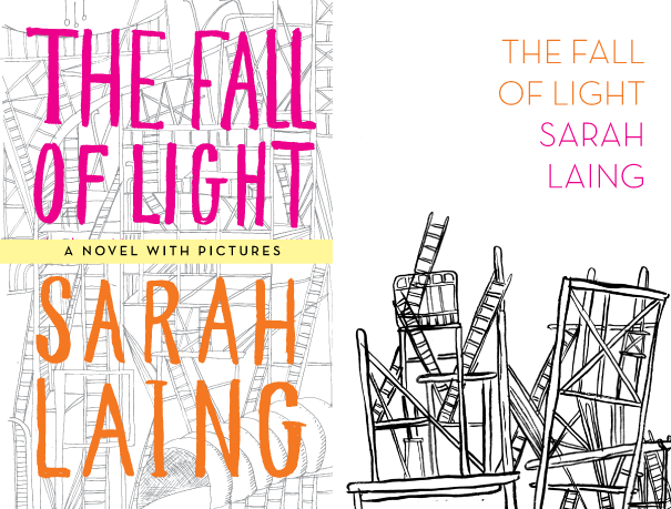
That amazing building full of ladders is a Brodsky and Utkin image, isn’t it? There was a big exhibition of their work at the City Gallery in the early 90s. I think they even came to Wellington… I remember my friend Elizabeth, who worked there, talking about them. Much of their work is a bit like that – strange and spooky constructions. Bit like Joanna Langford’s sculptures, but on paper! (I don’t mean to take the focus off your covers – amazing work – but I am kinda stunned that the names ‘Brodsky and Utkin’ came right back to me 20 years on!)