The making of a book cover
The guilt overcame me and I started on my book cover (see yesterday’s post). I’m not the kind of designer that can come up with one image and work on it until it is perfect. I have to create multiple images. Then I get myself into a stew because I can’t decide which one I like best. So I thought that I would share my process and use my cringe gauge to decide which ones I hate and which ones I like. Usually this gauge doesn’t kick in until I’ve released stuff into the public.
I started off at the beginning of December, assembling a number of images that I thought might suit the cover. Some of them were abstract, some were illustrative, some were photographic. We got rid of all the abstract art and photography and we decided on a colour palate (greens, reds and blues) and a style – more figurative than abstract – an illustration. Then I started drawing stuff in my sketch book. The one on the top left is inspired by an Amanda Blake illustration so I don’t think I can use it but I felt like I needed to draw my version of it so that some of her amazing painting abilities might rub off on me:


After that I switched to watercolour paper. I tried illustrating scenes from the title story in various degrees of realistic and metaphorical states.

A


 My next stage will be deciding which images I think work best as a cover, and applying type. I quite often do hand-drawn type but this time I think I’ll stick to computer-generated type. Something serif.
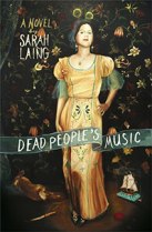
Do you have a favourite? I think mine is the top watercolour, the one of the two women in formal dress submerged in water. But it’s not entirely up to me.


Reblogged this on Desde mi ronco pecho.
God I love these. I love the image of the women in water too, somehow the Chinese dress and fox just take this into the stratosphere. Heck, isn’t it good to have an embarrasment of riches to choose from!
I like the chinese dress & fox fur / handbag the best x
I love the one you love too – it’s so good. Make sure you look at it at 120px wide too – so often book covers are that size online and just look lost or not as interesting as they did at full size. These are so great.
That is an excellent point! I almost think you need to design two versions – one for the bookshops, the other for the internet.
I like the one with the tattoos… It’s mysterious and cute
They’re all lovely. I like the tattoos one too, but I also like the standing in the water ones too, so my vote is for a combination of the two.
I like the standing in the water one, and also the one of two girls in a boat. But then, I’m kinda prone to literalness… (literality??)
Hi Sarah, Firstly, hello! I like your blog and am very happy to find another who still holds a torch for Morrissey. On your drawings: the girl with the bird tattoos across her back draws me in. It gives a little info, but hides as well and seems poetic. That image would make me pick up the book!
All fab. I love the fox too. None made me cringe, so, tough choice.
The one with her back to us; the pretty green dress and the pretty bird tats. But you can’t really go by me….I seem to like things no one else likes. They are all beautiful, by the way.
Back view and bird tats is my fav.
Hi Sara, I’m following the herd – the green dress w/tats stands out for me too. What a cool job you have 😉
I think the back view of the woman with tats is intriguing – nice sense of movement too, but probably would go for the one with two women in a boat – it makes me wonder about their relationship.
My favourite is the two women in the water.